Aster

Aster is a modern eyewear brand built around confidence, contrast, and everyday attitude.


Confidence, contrast, and everyday attitude.
We developed a visual identity and art direction system that gives the brand a sharper presence across campaigns, product launches, social content, and digital communication.
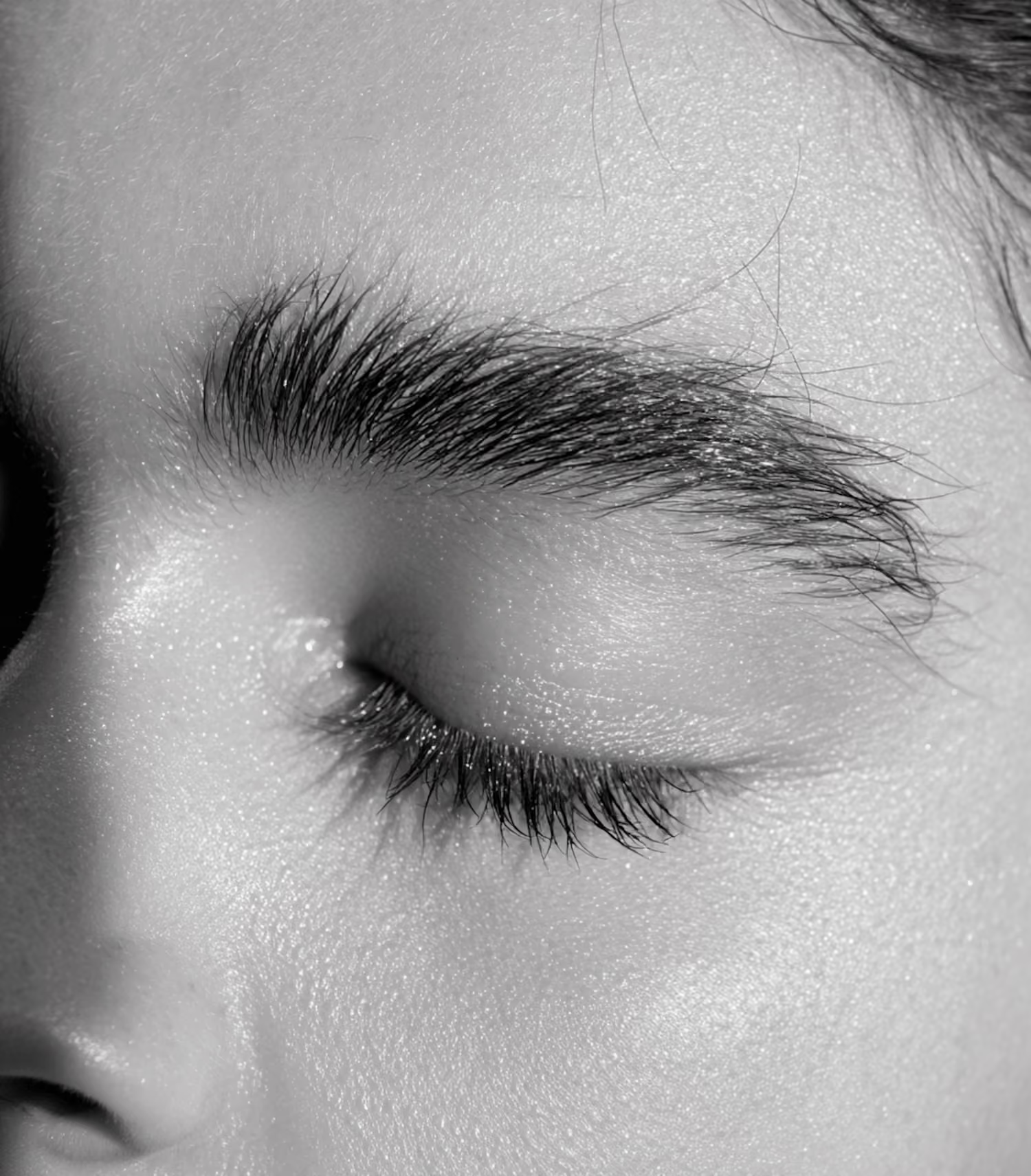
Aster needed a brand world that could feel bold, clean, and expressive without relying on seasonal trends.


We created a flexible identity system designed to work across product campaigns, editorial imagery, packaging, social media, and online launch materials.
The goal was to make every brand touchpoint feel connected, from a single product image to a full campaign rollout. Aster’s new system gives the team clear rules for layout, typography, image use, and visual rhythm, while still leaving enough room for creative variation.
The goal was to make every brand touchpoint feel connected, from a single product image to a full campaign rollout. Aster’s new system gives the team clear rules for layout, typography, image use, and visual rhythm, while still leaving enough room for creative variation.





“They helped us turn scattered ideas into a clear brand direction. The process was focused from the start, with strong thinking behind every visual choice. We now have a system that feels easy to build on.”

Head of Product, Spherule

“Our brand finally feels aligned with the level we operate at. What used to feel inconsistent is now structured, recognizable, and much easier to apply across packaging, content, and campaigns.”

Head of Product, Spherule

“They brought a strong creative point of view without making the process complicated. The final identity feels distinctive, flexible, and ready to support the next stage of our brand.”

Head of Product, Spherule
“They helped us turn scattered ideas into a clear brand direction. The process was focused from the start, with strong thinking behind every visual choice. We now have a system that feels easy to build on.”
Head of Product, Spherule
“Our brand finally feels aligned with the level we operate at. What used to feel inconsistent is now structured, recognizable, and much easier to apply across packaging, content, and campaigns.”
Head of Product, Spherule
“They brought a strong creative point of view without making the process complicated. The final identity feels distinctive, flexible, and ready to support the next stage of our brand.”
Head of Product, Spherule